

Divya Stuti
Divya Stuti, with over 5 years of experience in Digital Marketing & Content Writing, has a knack for turning complex Marketing strategies, trends, and jargon...
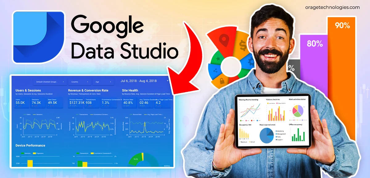
Everywhere your eyes roll, you see data, in the website, the campaigns, the pages, and the products. Data is the life and blood of any organisational success. Unleashing the power of data can offer exponential growth. However, handling the flood of data can be staggering, and much useful data can go unnoticed if not managed effectively. So, how do you filter data and extract meaningful analysis to drive decisions based on data? The answer is Google Data Studio or Looker Studio.
Looker Studio is an open-source data visualisation tool for marketers and analysts to transform raw data into interactive and insightful visual reports. In this blog, we will understand what Google Data Studio is, its benefits, and learn how to use it to create insightful reports.
What is Google Data Studio??
Google Data Studio is a cloud-based data reporting and BI tool built by Google. It was rebranded as Looker Studio in 2022. Though the rebranding came with no feature addition.
This visualisation tool helps users create custom dashboards, easy-to-understand reports that enable KPI tracing, trend visualisation and performance comparison over time.
Moreover, this business intelligence tool allows combining data from all Google platforms with real-time reporting, automated data updates and supports data blending.
Benefits of Using Google Data Studio
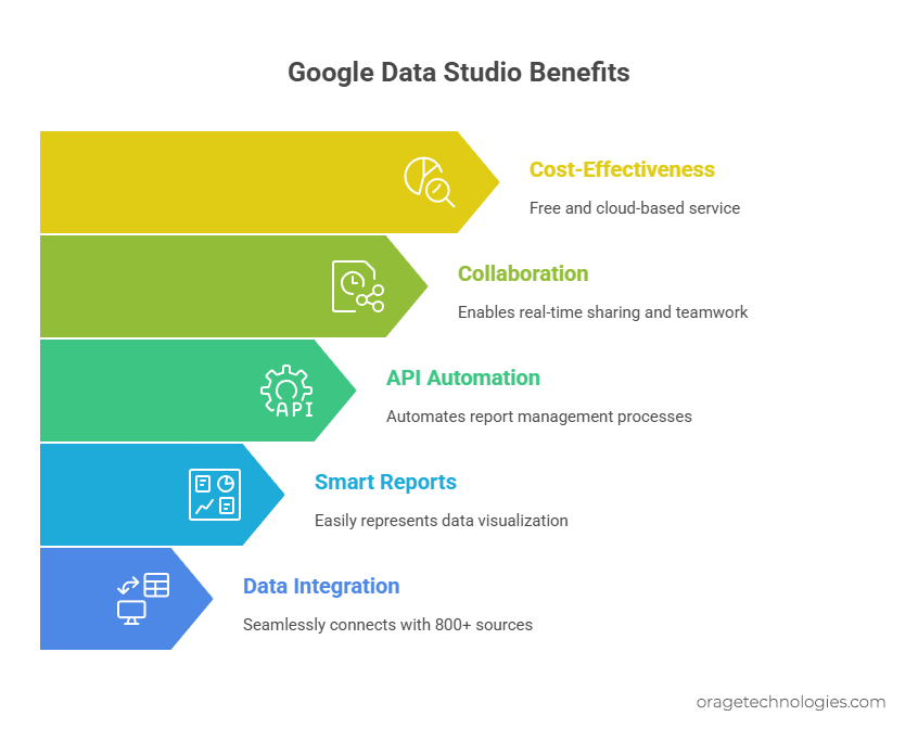
Whether you check your site analytics, your SaaS metrics, marketing indicators, or sales applications, Google Data Studio enables you to see your data in personalized views with no code.
The following are some of the outstanding advantages of Google Data Studio:
- Integrate With 800+ Data Sources Silently
It is easy to integrate data such as Google Analytics, YouTube, Facebook Ads, Shopify, SQL databases, and others.
Example: A digital marketing company can extract ad spend information on Facebook ads, traffic on Google Analytics, as well as be able to extract conversion information in Google Sheets, and view all such information in a single dashboard to monitor ROI on campaigns across platforms.
- Intuitive Smart reports to easily represent visualization
Quickly produce gorgeous, tableau-like reports and dashboards that have drag-and-drop charts, graphs, and filters. No design or coding knowledge is required.
Example: A small eCommerce company can display a multi-contributor smart report with clear insights about the day-to-day sales, product, and customer-behavior-and have it all in a single location. Through filters such as date range and product category, the team will be able to narrow down on what is successful and what is not.
- Looker Studio API to make Report Management automated
The Looker Studio API allows Google Workspace and Cloud Identity users to configure asset creation, update and grants without manual intervention.
Example: A large organization with hundreds of reports divided by departments that can utilize the API to bulk-assign editors, transfer dashboards between groups, or schedule refreshes of reports distribution-wide that would save dozens of hours of manual work.
- Sharing and Real-Time Collaboration
Provide stakeholders or clients with a link to share a report. Work together simultaneously as with Google docs.
Example: A remote marketing team can have dashboards on a campaign, co-edit, add comments, and deliver updates to the administrative level that does not mean the transfer of static files round and round.
- It’s Free and Cloud-Based
Google Data Studio is completely free and lives in the cloud, making it accessible from anywhere with an internet connection.
Example: A startup with a tight budget can still use enterprise-level data visualization tools without paying for expensive BI software.
With its powerful features and user-friendly interface, Google Data Studio is a go-to choice for businesses of all sizes looking to make smarter, faster decisions using data. Whether you’re a beginner or a data pro, it has something valuable to offer.
Disadvantages of Looker Studio
Though it is one of the most used BI tool, it has some limitations too:
- It needs good internet connectivity as it doesn’t work in offline scenarios
- Most of the connectors are paid
- Does not integrate well with third party tools
- You can add only 20 conditional formatting, 50 charts or boxes in single page and only 12 widgets
- Limitations to add data points
How Do I Use Google Data Studio?
Google Data Studio (Looker Studio) is one of the simplest ways to get engaged in data visualization tools in case you are a novice in that direction. It is free, self-intuitive, and allows you to create beautiful reports by connecting your data sources within a few clicks. I have described below step by step process related to use of Google Data Studio, though you may be a complete novice.
Step 1: Log In to a Google Data Studio
First, open Google Data Studio and log in to it with Google account credentials, whether Google Analytics, Google Ads, or Google Search Console. As soon as you log in, you will be taken to the Data Studio overview page. The main page has a home tab, which should be clicked to jump to your dashboard to begin to explore.
Step 2: Trouble-shooting in Data Studio Dashboard
After signing in, you will find a sample of reports of different types that takes you through a graphical preview of what you can get done. These interactive dashboards indicate how your data can be represented in tables, graphs, pie charts etc.
Hack: You can not and should not miss the Welcome to Data Studio! tutorial, which is an in-platform easy-to-learn introductory course and helps newcomers to get the basics from scratch fast.
Step 3: Learn Reports and Data Sources
The Reports and Data Sources will be among two major blocks on your dashboard.
Reports: These are the real dashboards in which you create and view your data.
Data Sources: This is the connecting factor between your report and the data that you want as a visualization.
To illustrate, in case you want to develop a report that will display your site traffic, you will have to connect it to Google Analytics as the data source.
Step 4: Linking Your Initial Source of Data
And the most important step is made now: making a connection with your data.
Google Data Studio already allows working with 500+ data sources through pre-built connectors making set up quick. Thereby, just click the button Add Data, and select the source of your choice.
Here are some of the most commonly used data sources:
- Analytics – Track website traffic, bounce rates, session duration, and more.
- Google Ads – Monitor campaign performance, cost-per-click, conversions, etc.
- Search Console – Understand search impressions, clicks, and keyword performance.
- BigQuery – Connect massive datasets and perform SQL-based analysis.
- YouTube Analytics – Analyze video views, watch time, and audience demographics.
- PostgreSQL – Pull structured data from your relational databases.
- Search Ads 360 – Gain insights into search campaign performance across multiple engines.
With your first data source connected, you’re now ready to start building dynamic dashboards that update in real time. Whether you’re tracking KPIs, campaign performance, or sales metrics, Google Data Studio makes it simple to visualize and share your data story with anyone.
How to Create a Report on Google Data Studio (Looker Studio)
Drawing a report in Google Data Studio is not as tricky as it may sound like. Raw data can be turned into savvy charts, graphs and dashboards with a few clicks. If you are a digital marketer, a business analyst, or a founder of a new company, this feature will allow you to visualize the most important metrics in real-time.
Now we will guide the process step by step and learn how to build a report prototype, add data providers, construct visual widgets and make the layout look professional.
Step 1: Add Data Source
Each report created in Data Studio starts with a connection to a data source, where you want your information to be obtained (such as Google Analytics, Search Console, or BigQuery).
To begin entering a new report to the database,
- Click on the blue plus (+) icon in the lower right corner.
- On the panel, press the tab marked as Add Data source and choose your intended connector (ex. Google Analytics).
- Click on Authorize to give access to Data Studio on your analytics account.
- Log-in to your Google Analytics account and find a Property you want to use then choose View and finally, click on Connect.
- A list of available measurements and dimensions will come up. To make the connection final, click on the Add to Report.
Example: Imagine that you have a blog site and you wish to know the most-visited blogs. You can also see the sessions by URL, the average length of user sessions, and the bounce rates by linking the Google Analytics.
Step 2: Insert a Widget (Visualization)
So when your data is connected, then it is one thing to add life to the data through the use of widgets which are visual representations of the data by means of charts, graphs and tables.
Popular widget types include:
- Pie Charts – for category distribution (e.g., traffic sources)
- Bar Charts – for comparisons (e.g., device vs. sessions)
- Time Series Graphs – for trends over time
- Tables – for listing items with multiple metrics
- Scorecards – for key KPIs like total users or conversions
- Maps – for geographic insights
Example: To track website sessions over time:
- Go to the toolbar → click Insert → Time Series.
- Drag to draw the graph.
- It will automatically set Date as the dimension and Sessions as the metric.
Step 3: Customize the Widget
You can personalize your charts to match your analysis goals.
How to do it:
- Change the metric (e.g., switch from “Sessions” to “Pageviews”).
- Change the dimension (e.g., from “Date” to “Landing Page”).
- Add a comparison period to analyze current vs. past performance.
- In the Date Range section, select a custom time window for your data.
Example: Compare this month’s traffic with last month’s to measure growth.
Step 4: Create Your Report Theme
Your data needs to be readable and visually engaging. That’s where Themes and Layouts come in.
How to customize:
- Go to Theme and Layout → Theme → Customize.
- Choose a prebuilt theme like “Simple Dark” or create your own.
- Pick primary and secondary colors, fonts, and chart styles.
- Adjust backgrounds, text formatting, and spacing to fit your brand style.
Example: For a client-facing SEO report, use your client’s brand colors and fonts for a more personalized presentation.
Step 5: Embed External Content
Take your report a step further by embedding live documents or media.
How to do it:
- Click Insert → URL Embed.
- Draw a transparent frame anywhere on the report.
- Paste the external URL (like a Google Sheet, YouTube video, or Doc).
- Style the embed with borders and sizing in the Style tab.
Example: Embed a Google Doc containing your monthly marketing strategy right inside the report for added context.
Step 6: Share the Report
Once your report is ready, it’s time to share it with others.
How to do it:
- Click the “Share” button at the top.
- Invite users via email or generate a shareable link.
- Enable link sharing to allow users without a Google account to view the report.
- Choose between view, edit, or comment-only access.
Example: Share your weekly performance report with stakeholders or clients so they can see real-time updates without requesting a new file every time.
By following these simple steps, you can build and share professional reports that turn complex data into clear stories. Whether you’re reporting to your boss, your team, or your clients, Google Data Studio makes it easier than ever to make data matter.
Conclusion
You don’t need to be a data scientist to make sense of data, Google Data Studio turns raw data into meaningful stories. With intuitive tools, endless connectors, and powerful visuals, you’re not just building reports, you’re building clarity, confidence, and smarter strategies.
Frequently Asked Questions:
- Is Google Data Studio still free?
Yes, Google Data Studio, now called Looker Studio, is still free to use for creating and sharing interactive data reports.
- What is Google Data Studio called now?
Google Data Studio is now called Looker Studio after being rebranded by Google in 2022 as part of its Looker analytics suite.
- Is Looker Studio better than Tableau?
Looker Studio is great for Google data integration and is free, but Tableau offers more advanced features for enterprise-level analytics.
- What is Looker Studio used for?
Looker Studio is used to create interactive dashboards and visual reports from various data sources to help analyze and share business insights.
- Is Looker Studio free or paid?
Looker Studio has a free version. For advanced features and enterprise support, Google offers Looker Studio Pro as a paid upgrade.
Also Read: AEO vs SEO: Is Answer Engine Optimization Taking Over SEO?
Divya Stuti, with over 5 years of experience in Digital Marketing & Content Writing, has a knack for turning complex Marketing strategies, trends, and jargon into interesting and easy to digest blog posts. Whether she’s breaking down the SEO, Social Media or decoding campaigns, Divya knows how to make marketing feel exciting and easy to understand. Armed with a sharp eye for strategy and a storyteller’s instinct, she writes with clarity, creativity, and just the right dose of wit.
More PostsRelated Posts
Divya Stuti
Divya Stuti, with over 5 years of experience in Digital Marketing & Content Writing, has a knack for turning complex Marketing strategies, trends, and jargon...

Divya Stuti
Divya Stuti, with over 5 years of experience in Digital Marketing & Content Writing, has a knack for turning complex Marketing strategies, trends, and jargon...